A few words about visual merchandising…
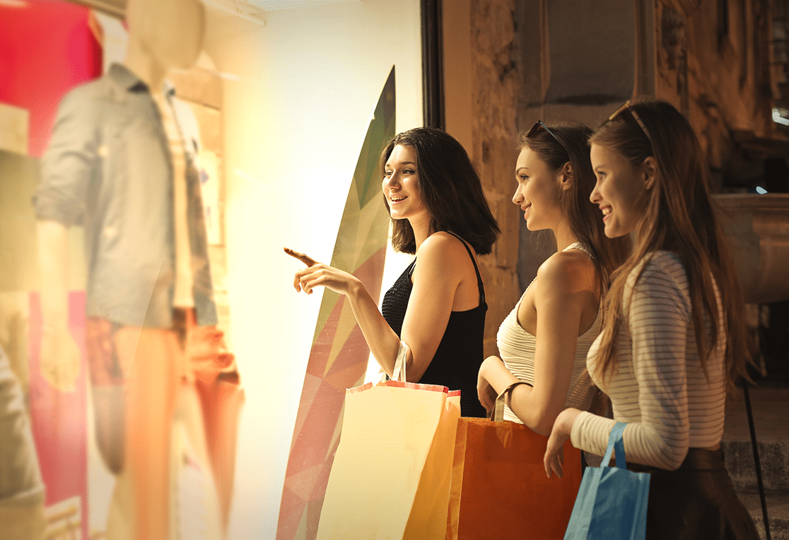
Have you ever interrupted your walk on the sidewalk to stare at an artfully decorated window display?
Have you been distracted by a -particular- product while crossing a store?
If the answer is yes, then you have been disoriented by visual merchandising?
-Tony Morgan in his book about Visual Merchandising: Window and in-store displays for retail-
Most human decisions are made unconsciously, just as purchasing decisions are made based on emotional processes. Visual merchandising, or “the art of product display”, influences the psychology of the consumer with the aim of attracting customers and creating interest in buying.
The role of lighting…
In comparison to other aspects of visual merchandising, lighting plays a very important role in the composition of a space that will attract customers. From the store window, to the general lighting of the space and from the lighting of the stands, shelves and counters to the last step, that of the final interaction between the customer and the staff, everything must be thought through to create a memorable shopping experience.
The strong contrasts between dark and light are initially intended to catch the eye of the passerby. As a first step towards achieving our goal, we want the window to “tell” a unique story, with a beginning, middle and end, keeping the ” visitor” captivated. With the help of the focal lighting we highlight the protagonist of our story and invite the customer to visit the store.
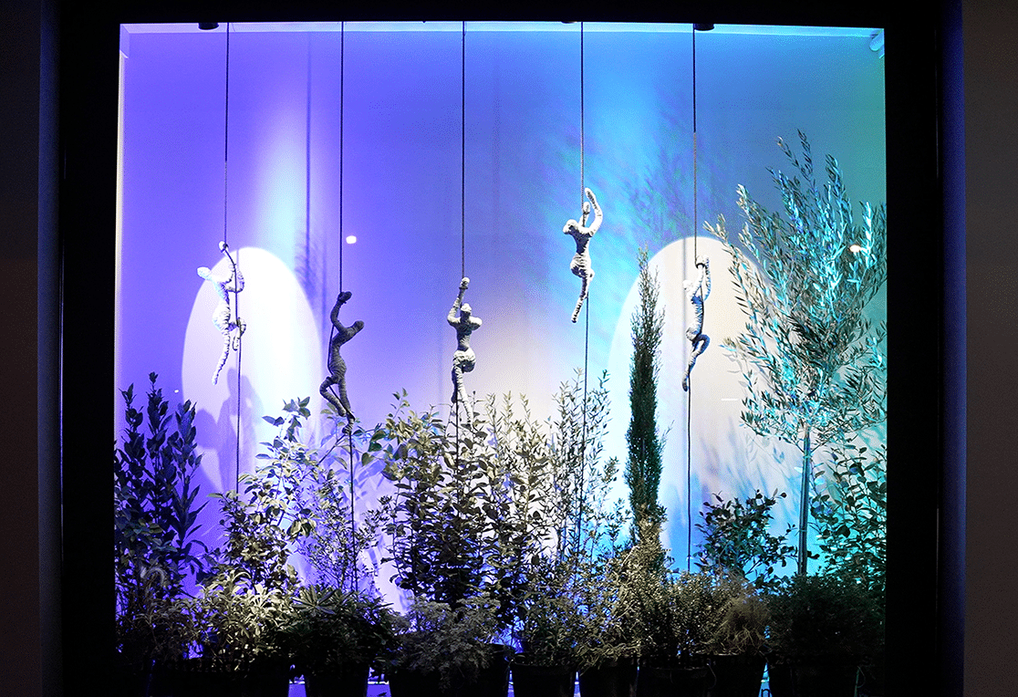
There are many techniques for setting up a store window, such as the technique of golden section¹, the pyramid², the repetition³, the direction4 and many others, where with the help of lighting we emphasize and complete the effect.
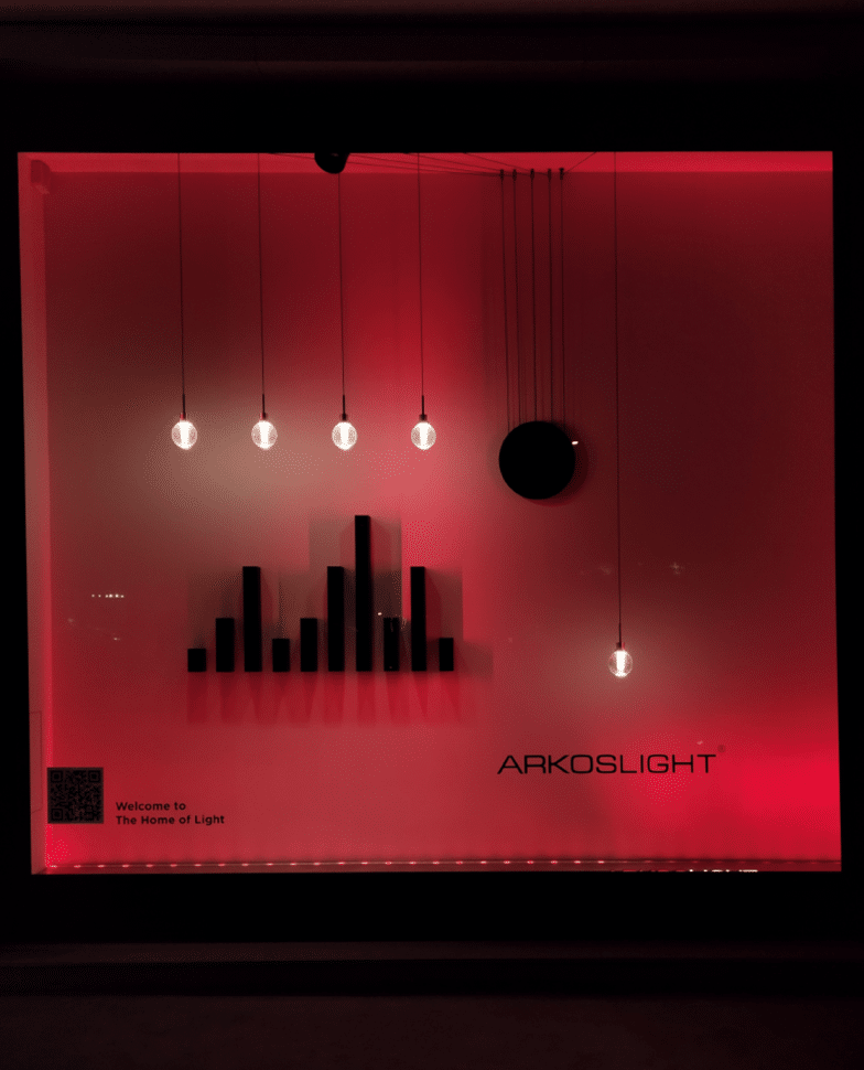
Having now identified the objects we want to highlight with one of the techniques of visual merchandising, our goal is now to bring them to the forefront. For example, how would we design the lighting in a window of a handbag shop where the golden section technique has been followed?
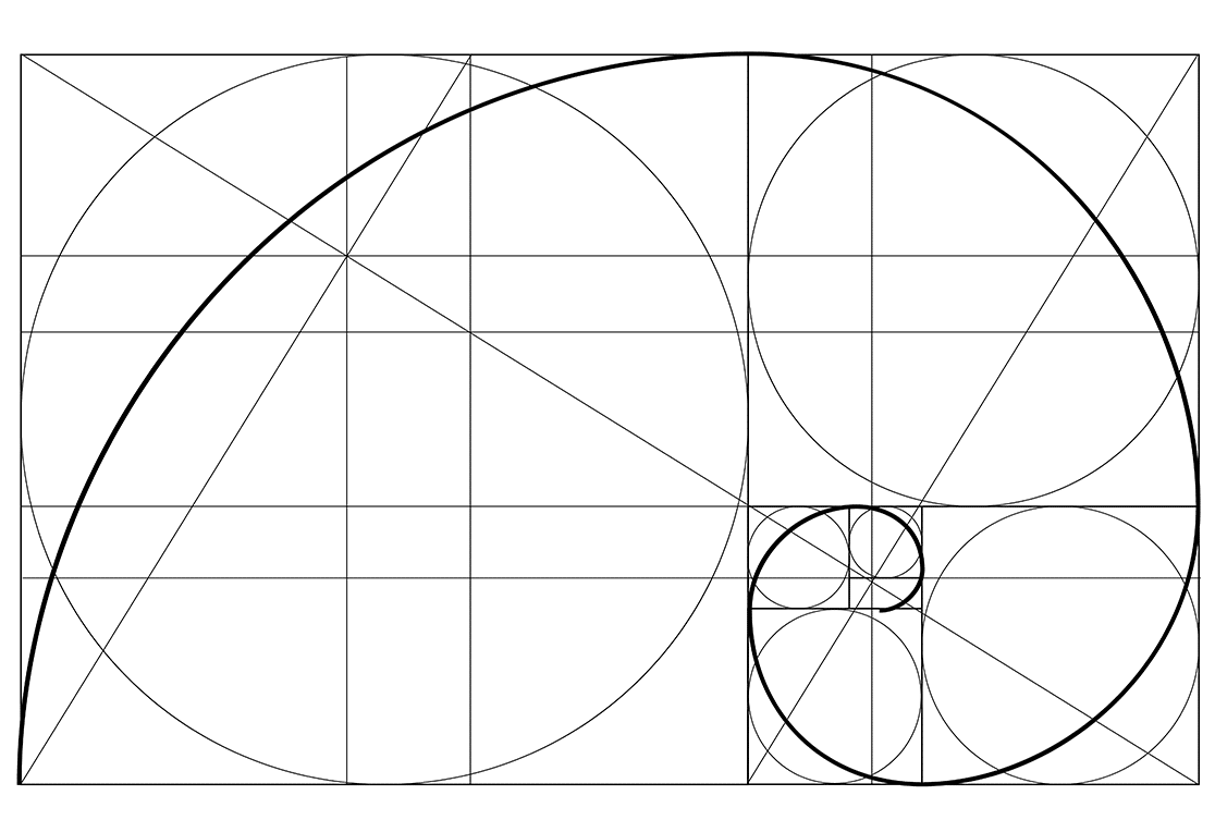
The protagonist of our story, the red bag with the characteristic pattern – the brand’s identity – has been placed at the point of the golden section. Since we want it to come into the foreground, we choose two light sources, with strong focal lighting, on the right and on the left, directed towards the face of the object, in order to give it volume. We choose the appropriate color temperature (CCT), up to 3000K in this case, and of course a high color rendering index (CRI) >95, to bring out the true color and texture. We then illuminate the background at a much lower intensity, in order to make the object stand out and gain plasticity. This results in a sense of complete harmony and the object has become more appealing to the audience.
Another important factor to consider when planning the lighting is that products, offers and displays change frequently. Therefore, lighting systems need to be flexible to adapt to current needs every time.
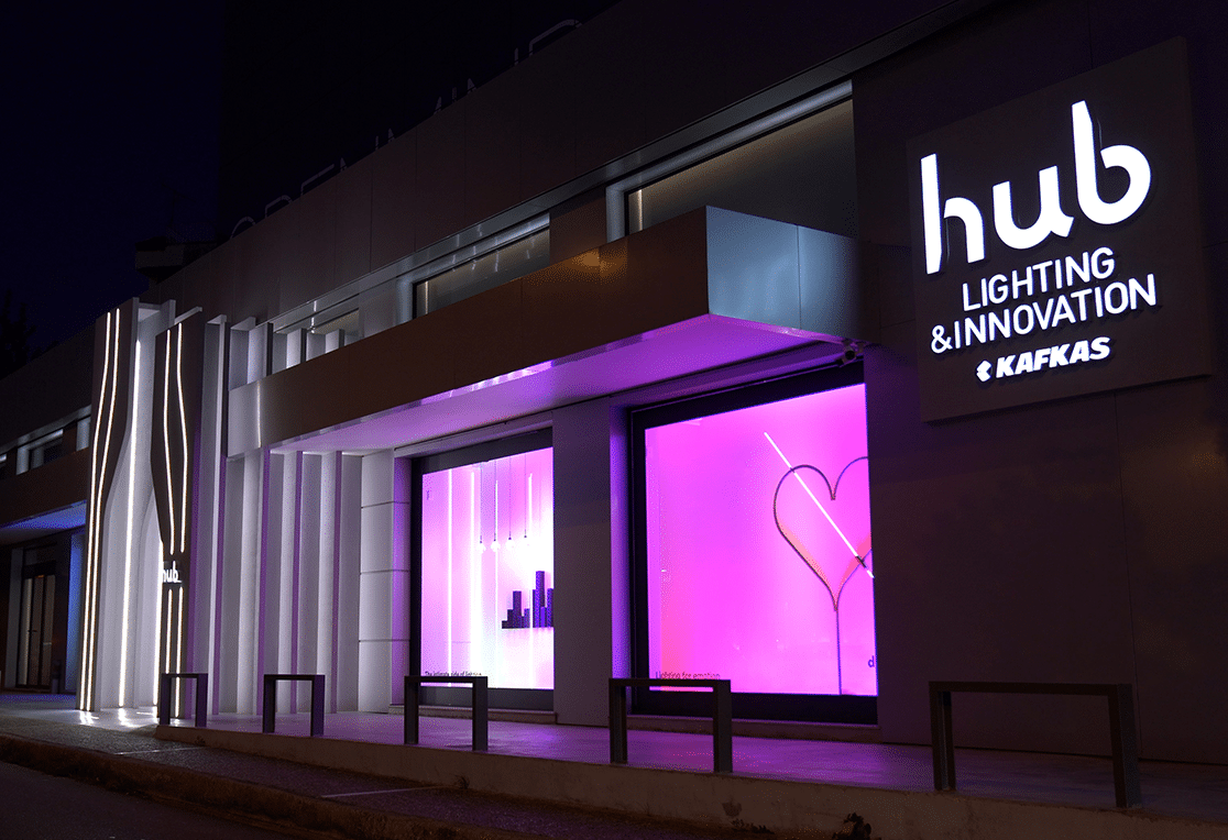
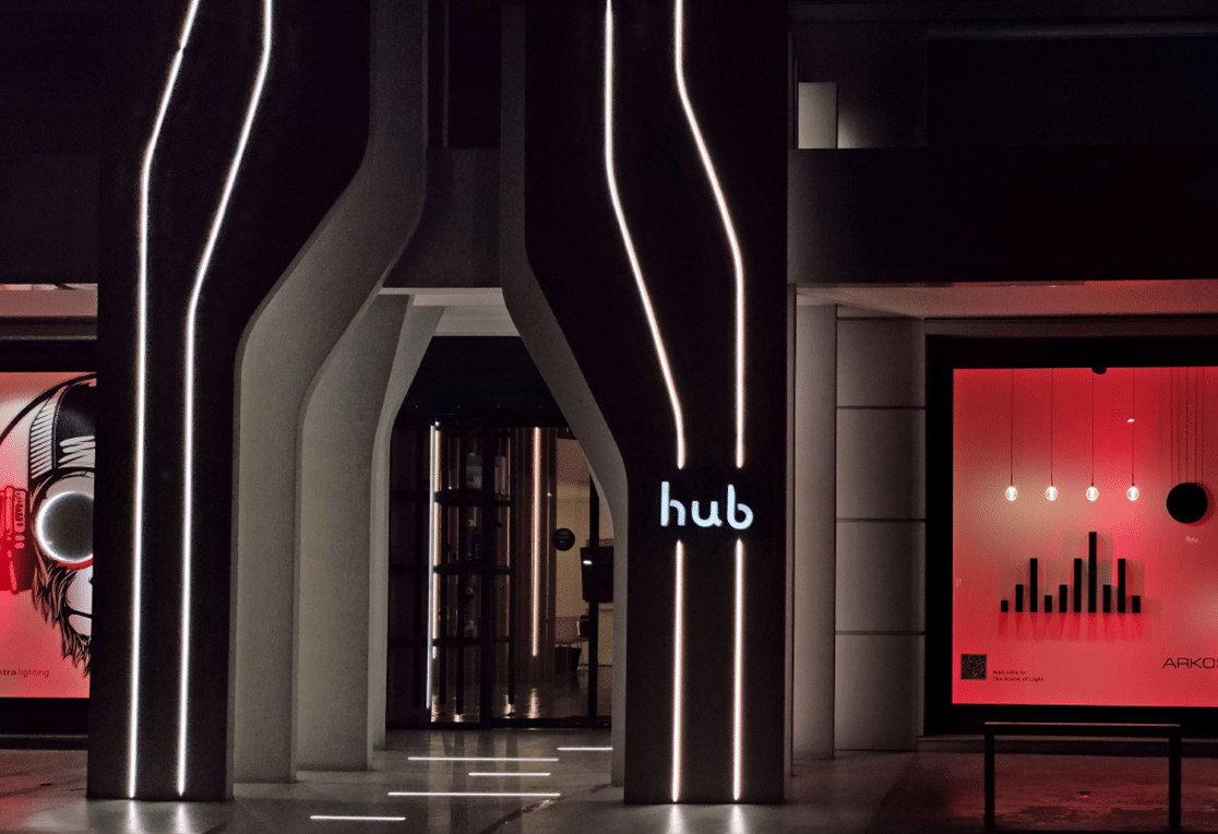
The next application is found in the general lighting of the store. In this step, we have already managed to attract the customer inside the store. Therefore, our goal is to create a pleasant environment, ensuring a sense of well-being. Only if customers find the atmosphere in a shop pleasant will they be motivated to stay a little longer. More time automatically means that the customer is provided with more opportunities to observe the products and brands on display and therefore make a purchase. High colour rendering index (CRI), appropriate colour temperature (CCT), low glare index (UGR) and correct general lighting levels (LUX) are our key tools to achieve the above.
Are there any areas in the store that you have noticed that have low traffic? This can be solved by making appropriate use of general lighting, defining for the consumer the route we want them to take in the store. Light creates hierarchies of perception, guiding customers within the space and leading them to the different merchandise areas. The different lighting levels, as well as the arrangement of luminaires, create zones and thus provide orientation. Uniform vertical lighting on the back walls of a space also serves to attract customers to the less visible areas of the store.

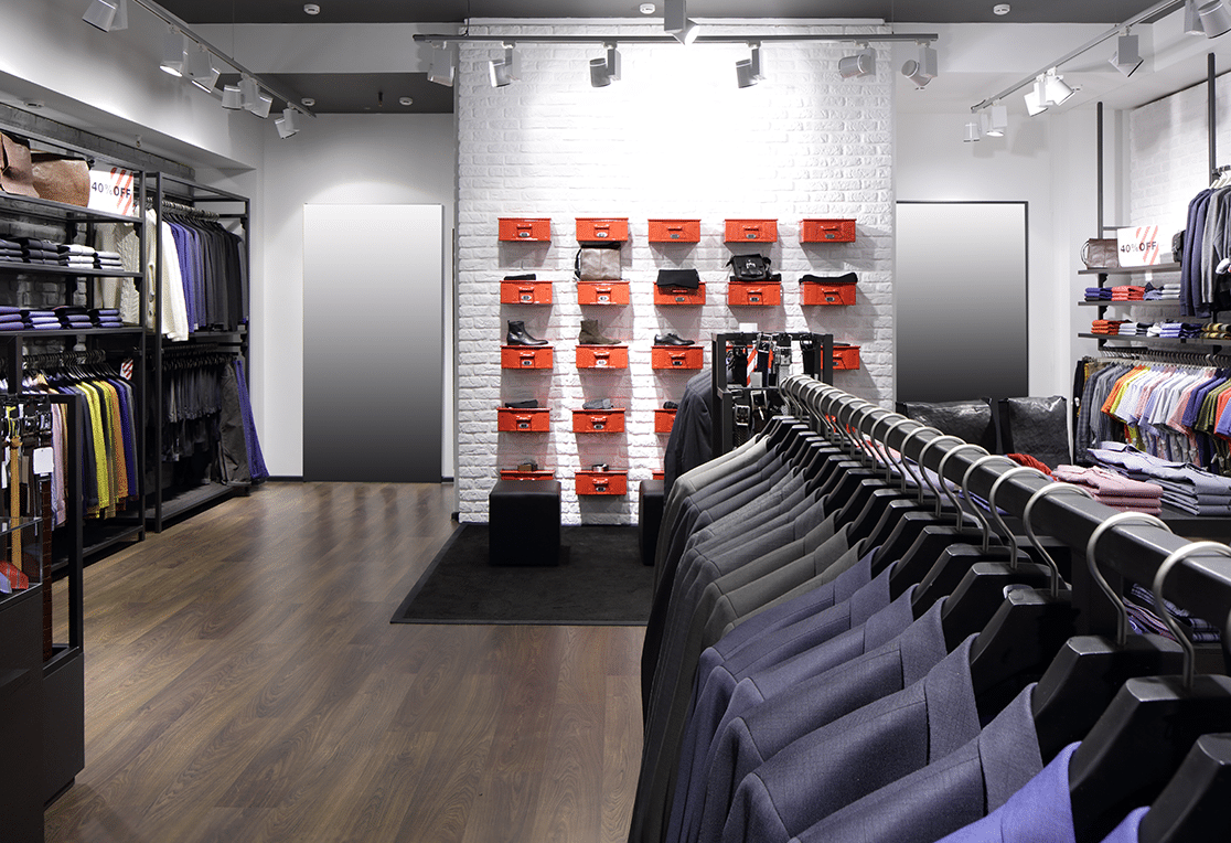
Objects separated by color combinations, stylistic identity and many more, are some more visual merchandising techniques that we can find on shelves, stands and counters. But how many times have you bought a blouse because you liked the shade, but when you saw it in the sunlight you were disappointed? On the other hand, how many times have you been intrigued by the ”hoodie” sweater with the very special knit that you didn’t intend to buy, but ended up adding to your shopping cart? That’s where the high color rendering that illuminates the items comes in to make a difference.

Placing many items in no particular order on the shelves is a way to give the consumer the impression that the products are widely consumed and, therefore, economical. This is not the case with lighting. Uniform lighting of a large number of goods eliminates the contrast between dark and light and does not help to create an important visual stimulus.
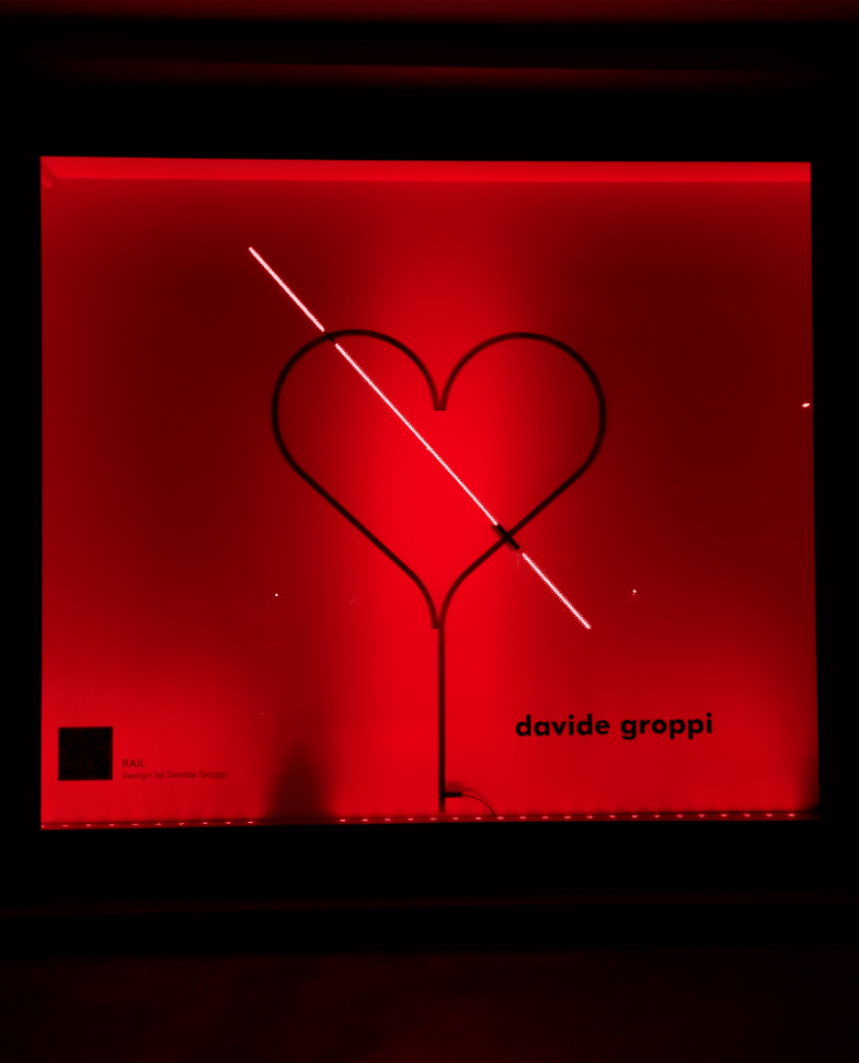
Of course, we cannot omit the value of decorative lighting, which not only contributes to the rest of the lighting, but also helps to create an elegant space, while giving it an identity. Sconces placed at eye level, table and floor lamps for a more intimate atmosphere, stylistic pendants with the right hanging, add visual interest.
With the above techniques and many others, the chances of attracting the customer and buying the product have increased. But does our efforts stop there? Of course not. We want the customer to leave the store and look forward to coming back. How can we achieve this? With the final customer-employee interaction. We light the checkout area adequately, since it is a work zone and we want the employee to perform his or her task in a relaxed and correct manner, if possible. In this way, we eliminate shadows and prevent glare from the luminaire itself or from reflections. The use of decorative pendant luminaires suspended 90cm – 120cm above the counter, so as not to obstruct the customer’s field of vision, can give a sense of hospitality and make the customer feel more comfortable and at home, encouraging them to visit the shop again.

Definitions:
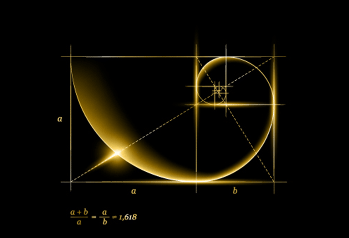
(1) The golden section technique – We place the objects in the space based on the golden section and preferably on the intersection of lines on the top left or right. It is the technique that helps to start the visual path, either by following the path of the diagonals that create the golden ratio or by placing the object we want to project exactly at the point of intersection.
(2) The pyramid technique – This is the technique that helps to start the visual path, from the top to the bottom of a composition, creating the shape of a pyramid. A non-symmetrical pyramid can also be formed, to give greater visual interest, with the back elements of the pyramid always at higher levels.
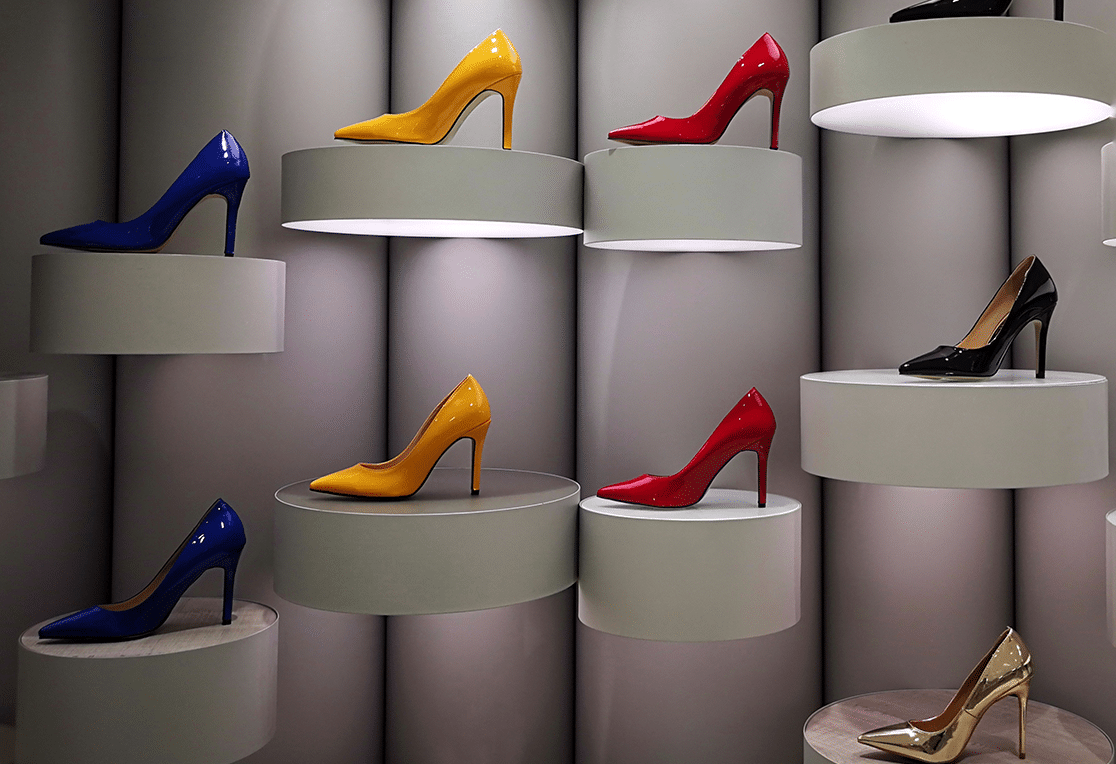
(3) The repetition technique – This is the most visually impressive technique of all. It is repeated in a horizontal, vertical or diagonal line of the same product or a combination of them. Repetition, can also be applied to details of the composition, with great interest when interrupted by a change.
(4) The directional technique – In this case, the objects are placed in such a way that they follow a path – direction.
Text Editor: Dora Attarnt – Lighting Consultant


